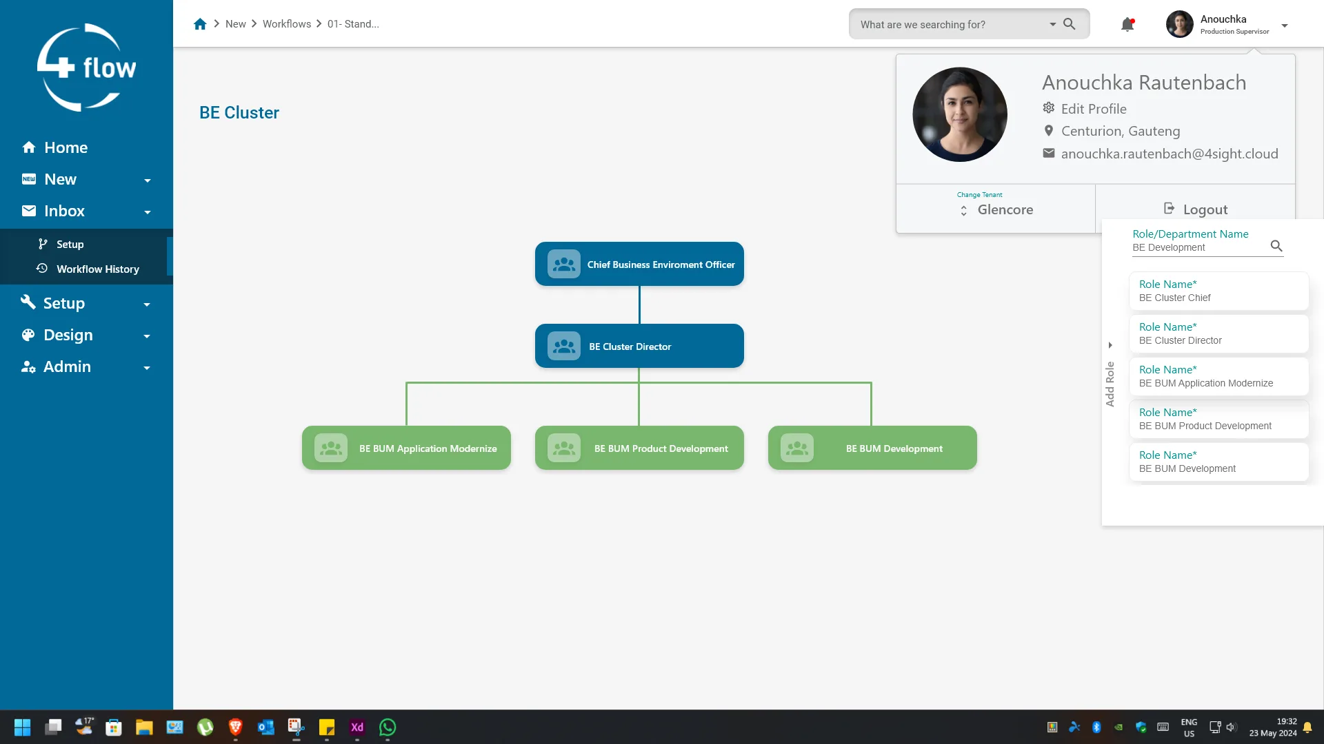
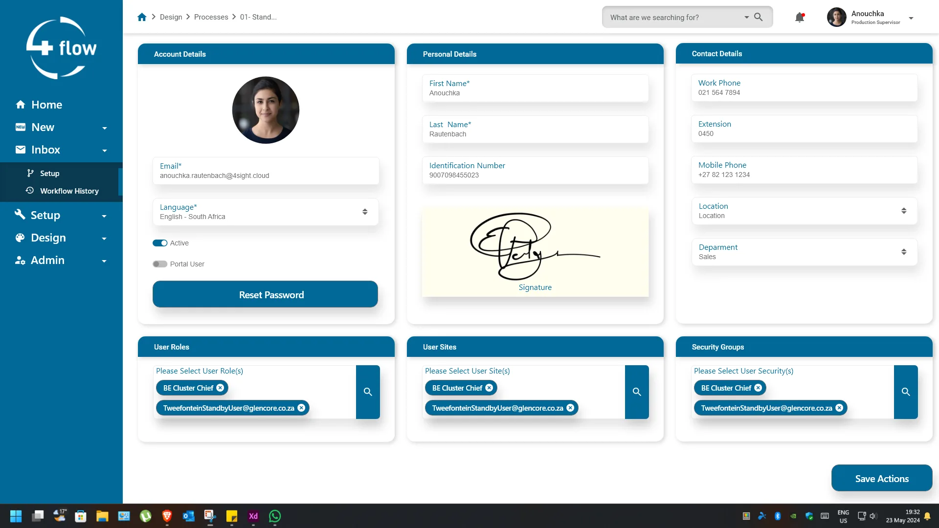
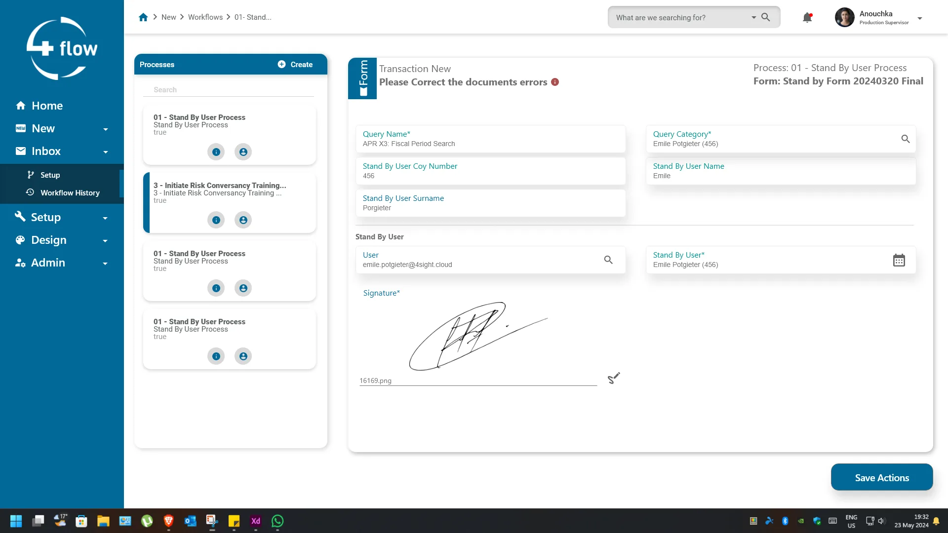
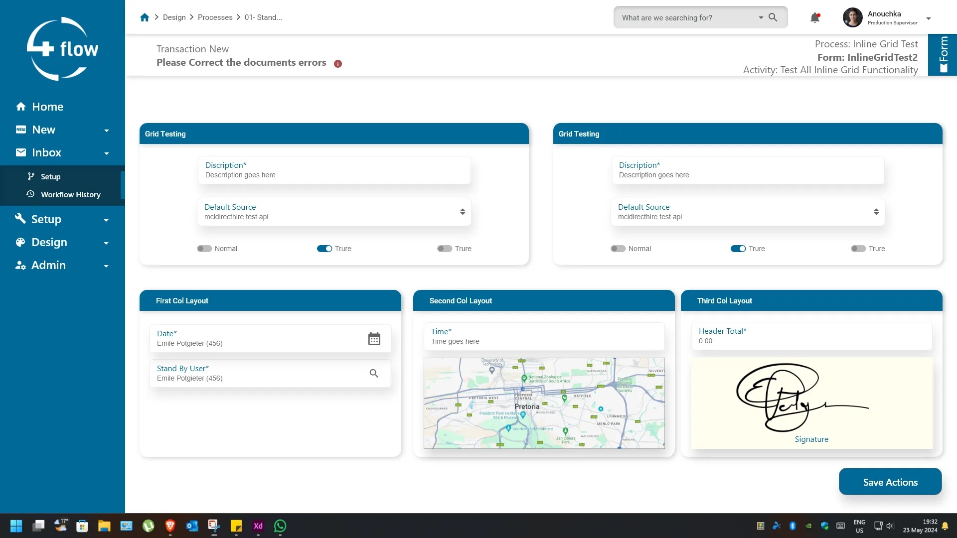
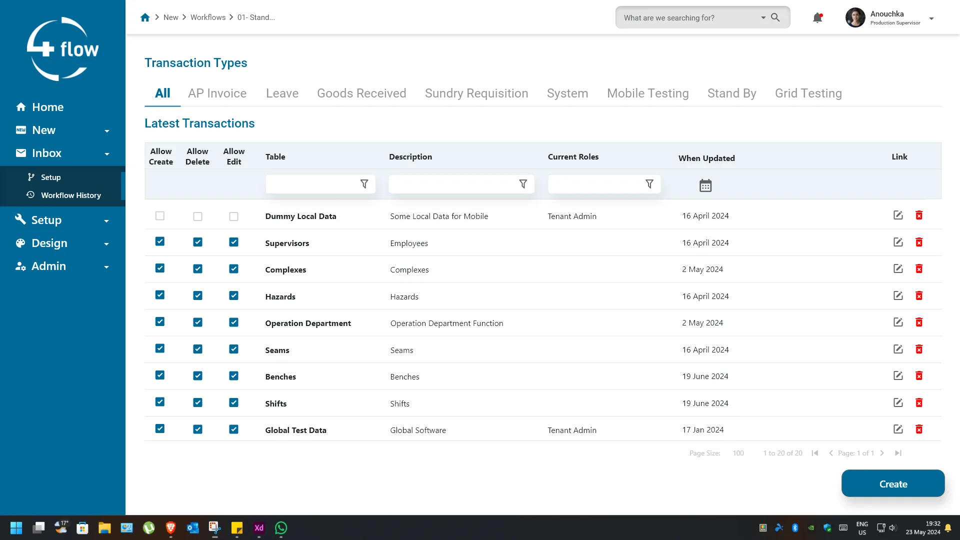
Revamping an intelligent process-automation platform to meet modern UI/UX standards — and to flex to every client's own branding and workflow.
The existing 4flow application faced significant challenges in usability, navigation, and user experience. Clients encountered difficulties in navigating the app due to its cumbersome interface and excessive steps required to accomplish tasks. Furthermore, the app lacked efficient customization options, hindering its adaptability to various client needs. Recognizing these shortcomings, our team embarked on a mission to overhaul the app's design and functionality to enhance user satisfaction and streamline operations.
Our primary objective was to revamp the 4flow application to meet modern UI/UX standards, providing users with a seamless and intuitive experience. Additionally, we aimed to improve the app's customizability, enabling it to adapt flexibly to the branding and workflow requirements of diverse clients.
Redesigning the app interface, enhancing customization, and ensuring multi-platform compatibility.
Adobe XD, Adobe Illustrator, Visual Studio, GitHub,C#,ASP.NET,JS,Razor
Leading UI/UX design, collaborating with developers, and managing project execution for client satisfaction.
Self directed, with feedback from the devs and clients.
To synthesize the qualitative data gathered from user interviews, I created an empathy map to identify patterns across users of 4flow, uncover key insights, and generate actionable needs. This helped in understanding user frustrations, goals, and how they interact with the app.
Tap a row to see what the research found.
Users consistently prioritised fewer steps and faster task completion over feature richness. The demand for intuitive, efficient tools is growing — and competitors are already delivering on it.
Usability testing confirmed that step count was the biggest driver of frustration. Users preferred solutions that minimise steps and automate repetitive actions — competitors with fewer clicks had measurably higher satisfaction.
Clients valued branding options that let them customise the interface without technical expertise. A white-label experience that matched their CI was a key differentiator — not a luxury.
"Fewer steps, more flow."
Every extra click is a potential exit point. The redesign treated step reduction not as a feature but as the foundation — every screen earned its place or was removed.
The blue workflow builder is 4flow's own platform — the green mobile app is the exact same product, reskinned for a client. Customization isn't a feature here, it's the whole point.
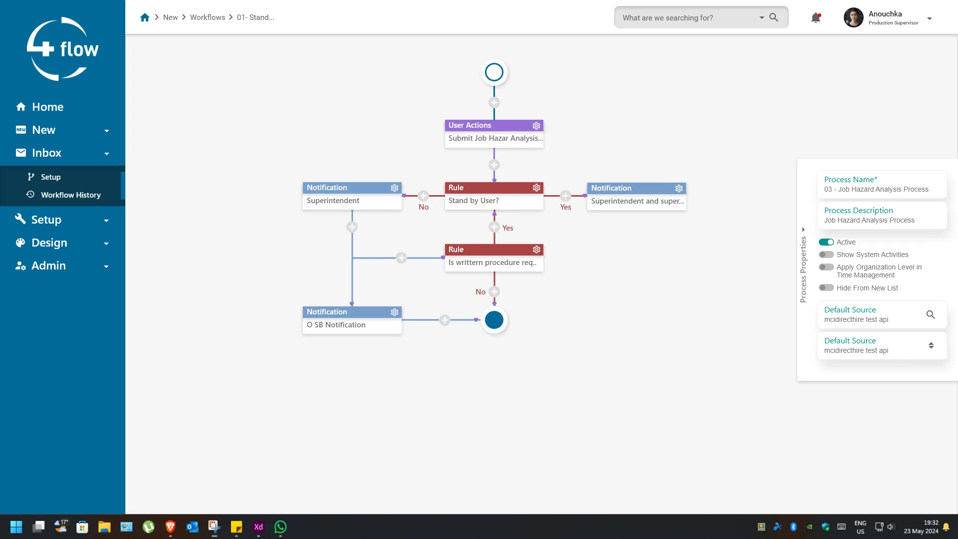
A fully rebuildable process-automation platform — faster to navigate, easier to brand, and flexible enough for every client's workflow. Fewer steps, more flow.