The Product
Final Designs
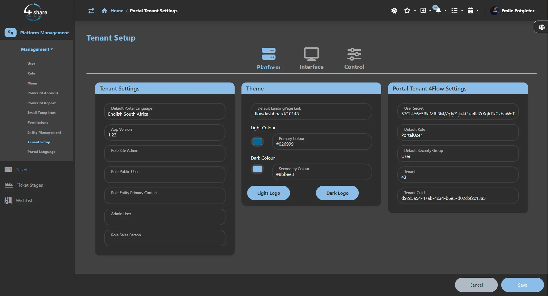
A look at the finished dashboard — from tenant management to role-based views and the customisable layout system.
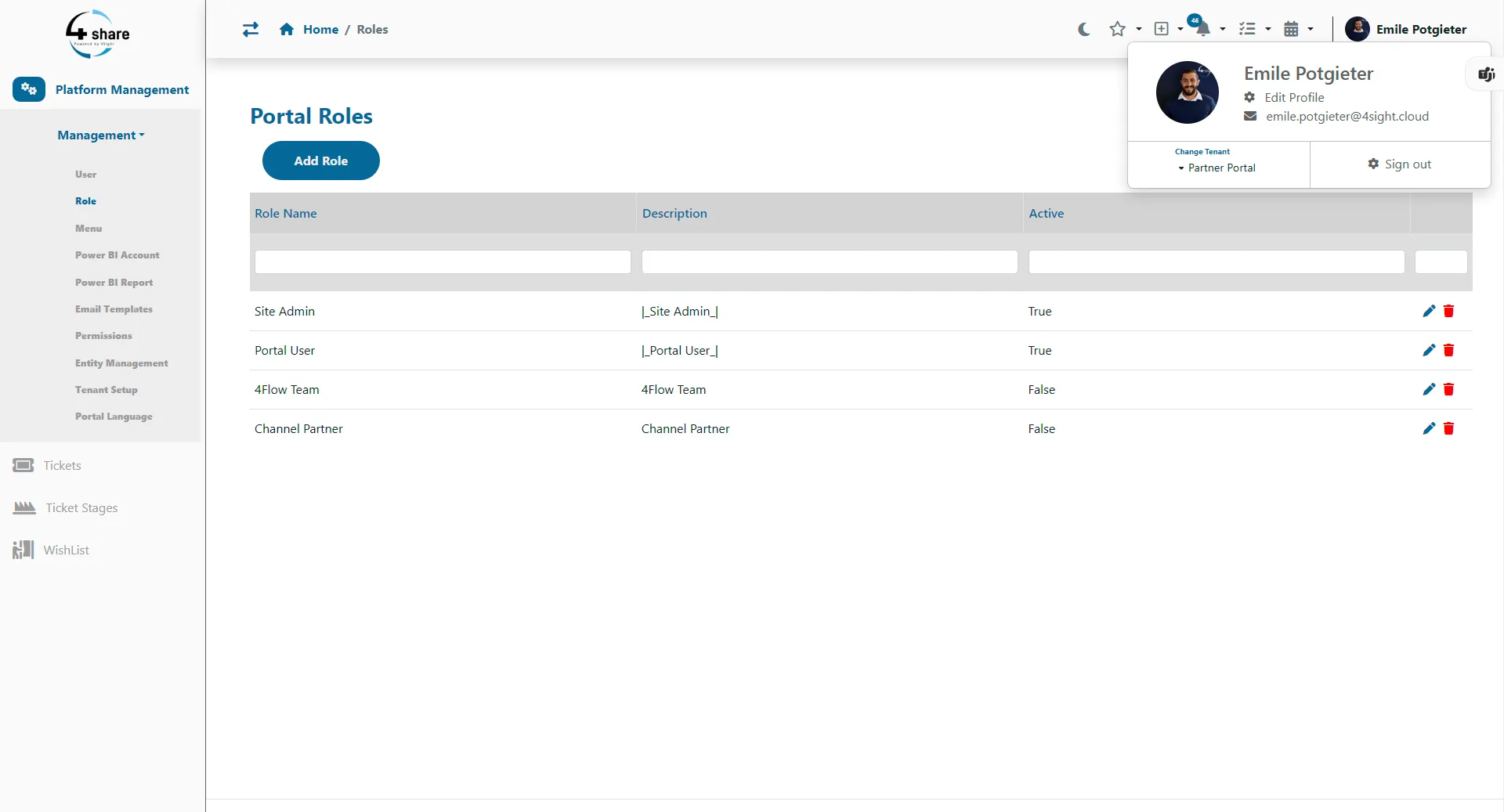 Dashboard Overview
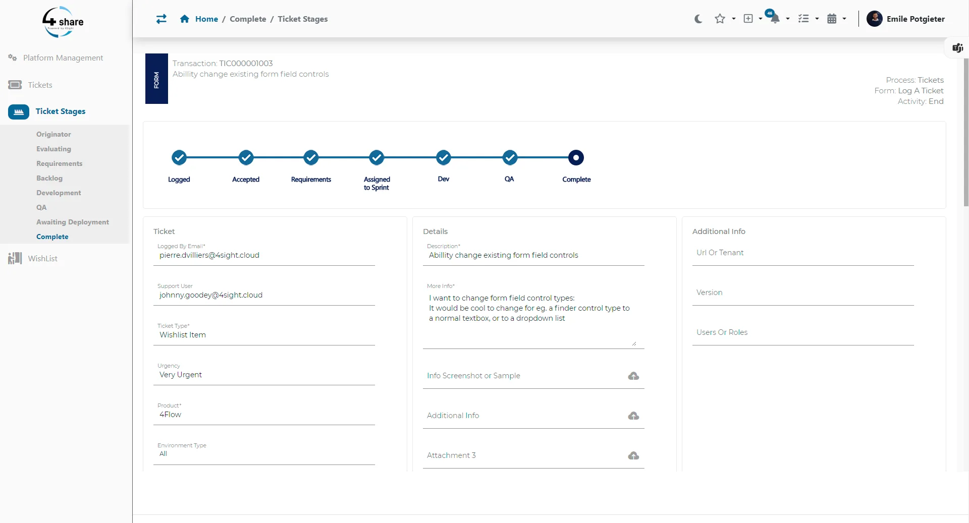 Tenant Management
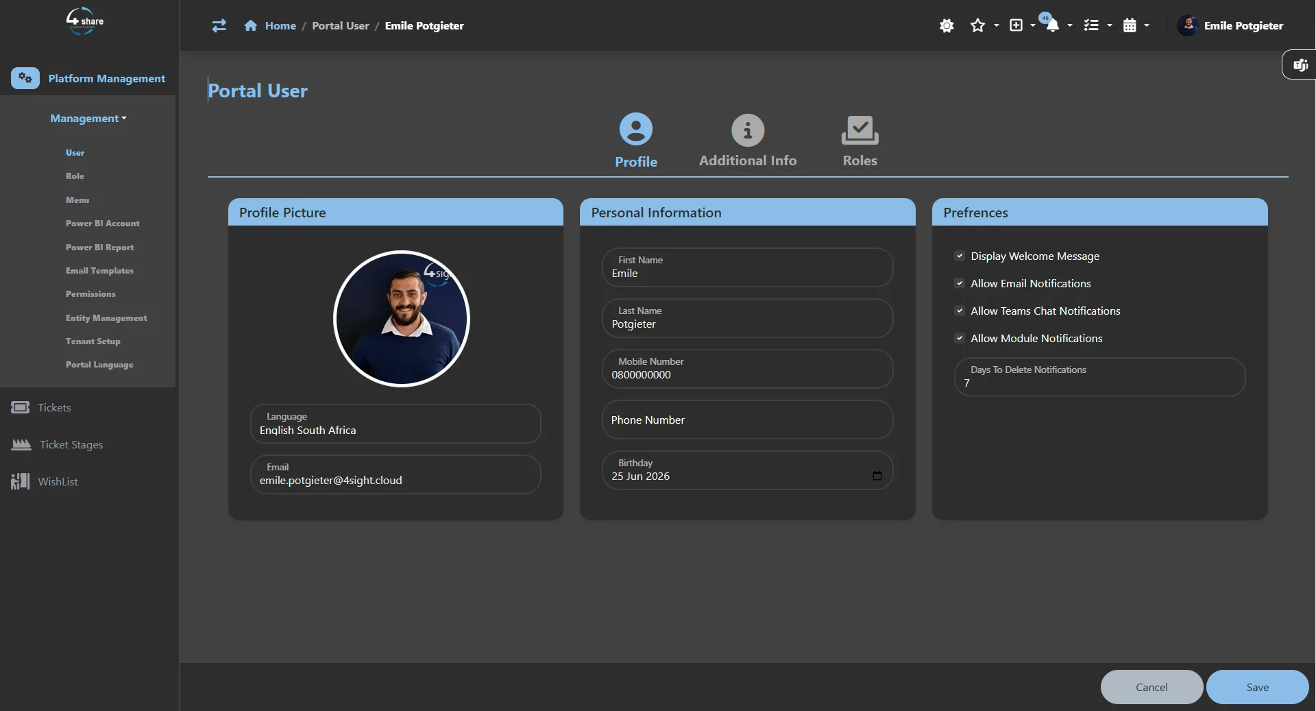 License Control
 User Management
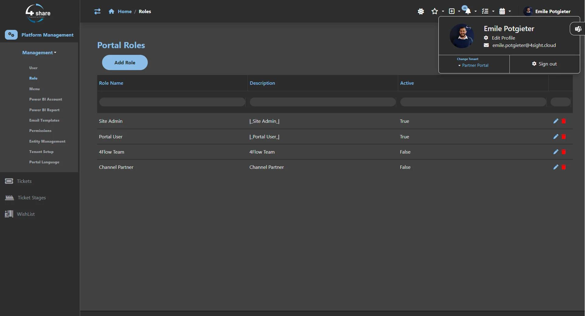 Active Clients
 Role-Based View
Designing a multi-tenant web dashboard that lets admins manage tenants, licenses, users, and active clients — without the chaos of juggling disconnected tools.
Designing a versatile web dashboard for an existing backend system poses two intertwined challenges. First, the interface must integrate seamlessly with the backend while giving users meaningful control over how their dashboards look and behave. Second, supporting multiple tenants, licenses, user roles, and active clients introduces significant complexity — data must stay organised, access must be controlled, and the experience must remain coherent as the system scales.
Build a user-friendly dashboard that integrates cleanly with the existing backend, letting administrators manage tenants, licenses, users, and active clients from a single, customisable interface — without sacrificing clarity or control.
A multi-tenant web dashboard with customisable views, role-based permissions, tenant management, and active-client tracking.
Figma, React.js, Bootstrap, Visual Studio, GitHub
Leading UI/UX design, ensuring accessibility, and collaborating with the development team to deliver features that match user requirements.
Self-directed, with feedback from a mentor and peers.
Through stakeholder interviews and usability reviews of existing admin tooling, I built an empathy map to surface where multi-tenant management breaks down. The patterns pointed clearly to cognitive overload from context-switching and a lack of trust in data visibility.
Tap a row to see what the research found.
Interviews confirmed that admins routinely switch between 3–4 separate tools to complete a single management task, creating errors and lost time.
Users frequently attempted actions outside their permissions, indicating the UI gave no clear affordance for what was available to their role. Surfacing role state reduced confusion significantly.
Stakeholders validated that layout customisation was a top-requested feature. Prototype testing showed admins could reorganise their workspace in under 2 minutes without any guidance.
"Admin power without admin complexity."
Every decision prioritised giving administrators full control while keeping the interface lean enough that power users and occasional users alike could act confidently.
A look at the finished dashboard — from tenant management to role-based views and the customisable layout system.
Dashboard OverviewTenant ManagementLicense ControlUser ManagementActive ClientsRole-Based ViewDashboard OverviewTenant ManagementLicense ControlUser ManagementActive ClientsRole-Based ViewA multi-tenant admin dashboard that consolidated tenant, license, user, and active-client management into a single, role-aware interface — with customisable layouts that empower admins without engineering support.